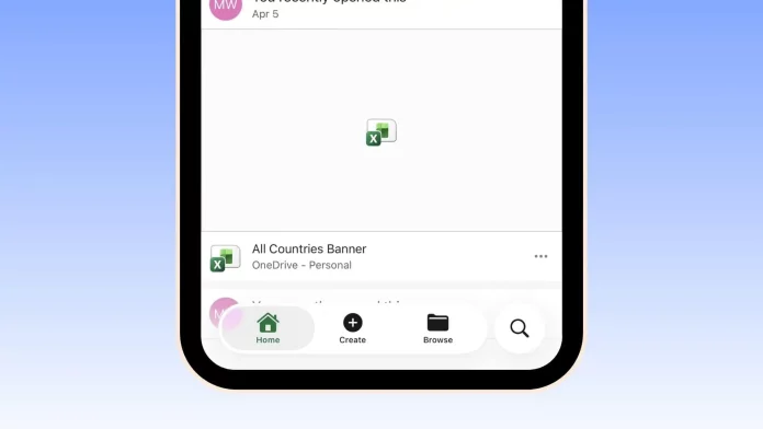
Microsoft is beginning to adopt Apple’s new Liquid Glass design language in its iPhone Office apps, giving Word, Excel, and PowerPoint a more refined and platform-native look. Early test builds reveal frosted panels, glossy depth around icons, and fluid translucency that reacts to motion and light—making the apps feel deeply integrated with Apple’s refreshed aesthetic rather than simple ports from another OS.
Tech analyst Max Weinbach was the first to share clear evidence of the change on X, posting screenshots that showcase the Liquid Glass effects across Microsoft’s Office suite on iOS. His findings match what several users have started noticing in recent app updates, suggesting a phased rollout across accounts.
A Move That Aligns With Apple’s Design Direction
Apple introduced Liquid Glass at WWDC 2025 as the cornerstone of its visual system across iOS 26, iPadOS 26, macOS Tahoe 26, watchOS 26, and tvOS 26. The design emphasizes responsive, tactile surfaces that refract the surrounding environment and subtly shift to draw focus to content. Developers can adopt the new material with minimal extra work thanks to Apple’s dedicated APIs.
Microsoft’s decision to follow suit is both aesthetic and strategic. By embracing Apple’s design language, Word and Excel feel at home on iPhone, aligning with Apple’s native conventions instead of standing out as cross-platform exceptions. The change helps the apps better reflect Apple’s modern design philosophy—soft, layered, and immersive.
Practical Benefits for Developers
Beyond the visual alignment, there are pragmatic reasons for Microsoft to embrace Liquid Glass. Apple’s APIs handle most of the complex rendering and motion calculations, freeing developers to focus on layout, spacing, and contrast. The result is smoother iteration, improved visual coherence, and reduced development overhead.
Accessibility and Usability
As with any transparent or motion-rich UI, accessibility remains a key challenge. Some users have reported eye strain from the depth and parallax effects in certain icon sets. Microsoft is expected to respect Apple’s system-level options such as Reduce Transparency and increased contrast, ensuring long editing sessions remain comfortable and text remains legible.
How to Try It Yourself
To see the new look on your device:
- Update your iPhone to iOS 26.
- Install the latest versions of Word, Excel, and PowerPoint from the App Store.
- Open a document and look for frosted headers, subtle glows around toolbar buttons, and translucent panels that
dynamically blur what’s behind them.
If the visuals appear too soft or distracting, you can tweak them via Settings → Accessibility → Display → Reduce Transparency. Increasing contrast will also help sharpen edges and improve text clarity.
Looking Ahead
For now, the rollout is iOS-only. Liquid Glass relies heavily on Apple’s proprietary rendering engine and motion layers, which has no true equivalent on Android. While similar effects can be replicated with heavier blurs or opaque layers, they lack Apple’s native responsiveness. Microsoft’s early adoption signals that third-party embrace of Liquid Glass is picking up speed—and Office just gave the movement its biggest endorsement yet.


