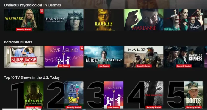
I keep close tabs on everything happening at Netflix — it’s part of my job — and something strange caught my eye this weekend. Across many platforms, Netflix has quietly removed the signature “N” badge from its home screen tiles. That little logo used to tell you which titles were Netflix originals, distinguishing them from licensed ones that might vanish after a few months or years.
Now, that distinction is gone. And Netflix isn’t saying why. But a few compelling theories are floating around.
1. Building the Biggest, Most Seamless Catalog
Netflix may be aiming to blur the lines between what it owns and what it rents. For most subscribers — the “general audience” — it’s easy to assume that everything on the platform is part of Netflix’s permanent library. When Breaking Bad and Stranger Things sit side by side without any badge or border, it subtly reinforces that idea. It makes Netflix’s library look enormous, unified, and timeless — even if that’s only partly true.
2. Shaking Off the “Netflix Original” Stigma
Let’s face it: not every Netflix Original has been a critical hit. There’s a perception among some viewers that Netflix-produced content often lacks the quality of high-profile licensed shows. By removing the “N,” Netflix could be dismantling this bias — encouraging viewers to click without prejudice. Once you’re watching, the branding appears inside the player, but by then, you’ve already pressed play.
At the same time, those who intentionally search for Netflix Originals won’t be able to easily favor them over licensed titles, helping Netflix drive engagement across all categories.
3. Making Licensed Shows Look Fresh
Consider this: Mr. Robot just landed on Netflix. Without the “N,” casual browsers might think it’s a brand-new show exclusive to the platform — especially since few people track which series are licensed versus original each month. Presenting licensed additions as “new Netflix content” can make the catalog feel more alive, boosting discovery and engagement across older but critically acclaimed shows.
4. A Simpler, Cleaner Interface
There’s also a more mundane explanation: a design choice. Removing the “N” might simply be part of a broader effort to streamline Netflix’s UI. It’s distinct, too — while almost every streaming service brands its originals (think “HBO Original” or “Apple TV+ Original”), Netflix might see value in a minimalist, universal look. After all, not all branding invokes prestige, especially if the symbol itself doesn’t carry the same cultural weight as HBO’s.
So What’s Really Going On?
Whatever the reason, this feels intentional. The fact that the change is rolling out widely — not just in isolated tests — suggests Netflix sees long-term value in this shift.
As someone who obsessively tracks new releases, I now have to click into every show to figure out whether it’s a brand-new Netflix production or a licensed gem they’ve quietly picked up.
Hooray for mystery.


